When it comes to website landing page design, there is no one size fits all solution that will work for every product or service. Landing pages can serve many different purposes, and the type of business you have and your goal for your landing page will determine what the best landing page design is right for your business.
No Such Thing as One Size Fits All
Unlike a traditional website, a landing page is a one-page destination with one focused call to action. A landing page should be very focused with one clear message, supported by a headline that will engage visitors.
The content should be informative but not overwhelming, with eye-catching graphics or infographics and a clear call to action, which is the most critical component of the landing page. The goal of a landing page will vary depending on what you are trying to accomplish:
- If you are trying to build an opt-in email list, the goal will be to get visitors to sign up and provide their email.
- If your goal is to sell a product, you may develop a creative landing page design that drives people to purchase.
- If your goal is to get people to register for an event, you may find the perfect landing page looks different than those designed for product sales or email capture.
There is no one single approach to creating a good landing page design; what works the best will depend on the goal you have for your landing page.
Reviewing Some of the Best Landing Page Examples
Because there is no one best landing page design, a way to gain an understanding of what works well is to examine some of the best landing page examples of businesses that have successfully implemented them.
Below are 4 examples of landing pages as well as some of the reasons they are effective.
Upwork’s Landing Page Design
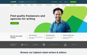
Upwork is a company that connects freelancers with businesses or individuals looking for services. One of the most popular services on Upwork is freelance writing.
The Upwork freelance landing page is clean and straightforward, with a clear call to action in the form of a “Get Started” button that takes you to a page to sign up with Upwork.
The image uses a picture of an actual freelance writer that uses Upwork, and there are short descriptions of the types of work you can find as a freelancer.
Costco’s Landing Page Design
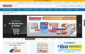
The Costco landing page has a website landing page design that is slightly different from other landing pages in that it has significantly more information as you scroll down through the page.
However, the call to action is strong in each section of the landing page, whether it is to sign up for a new membership, renew your current membership or sign up for a Costco credit card.
At every turn, Costco gives visitors the opportunity to “Sign Up.” While the page is longer than many landing page designs, there is a call to action button visible no matter where you are on the page.
Vimeo’s Landing Page Design
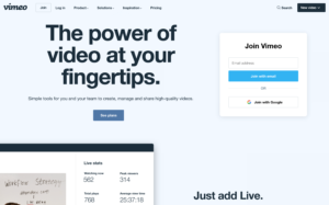
Vimeo is a video-hosting platform that provides businesses with tools and technology to host, distribute, and monetize videos. They offer a variety of plans designed to meet the needs of different kinds and sizes of businesses.
Since this is a company focused on video, there is more video on the landing page than you may see on other landing pages.
Remember, the best landing page design is the design that best executes your strategy and reflects your business’s value proposition.
The Vimeo landing page is clean with a clear call to action “See plans.”
Blue Apron’s Landing Page Design
Blue Apron is a food home delivery service that lets you choose a weekly menu and then have the fresh ingredients and recipes delivered to your home. A convenient solution for those looking to save time and the hassle of coming up with their own recipes.
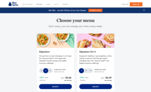
The Blue Apron landing page targets first-time users and tries to hook them with an introductory offer. Since this is a product-focused on food (the eyes eat first!), the primary graphics are beautifully prepared Blue Apron meals.
The call to action is crystal clear, a blue button that prominently says SELECT.
8 Tips and Tricks for the Best Landing Page Design
When coming up with the best landing page design for your business, there are a few key concepts that you should keep in mind.
- Include a prominent call to action. This should be your landing page’s focus, so don’t be afraid to be clear about what you want your visitors to do and use eye-catching colors and pictures.
- Keep your call to action message short, between two and four words.
- Use action-oriented verbs, like “Join,” “Get,” “Request,” and “Subscribe.”
- Incorporate a subtle hint of persuasion and urgency.
- Use language that is consistent with your brand messaging and identity.
- Be clear and direct, so visitors know exactly what to expect when they click on your call to action button.
- Use engaging pictures, graphics, and videos.
- Minimize scrolling. Your most important information should be on the part of the page visible on the screen before a visitor has to scroll down. It’s essential that you optimize this for both desktop and mobile visitors. If visitors do have to scroll, consider repeating the call to action button, so it is always visible.
As you’ve seen in the landing page examples above, while the specific design and content of each landing page are different and unique to each company, the basic tenants of a successful landing page are laid out thoughtfully. An optimized landing page can effectively transform prospects into leads and ultimately into customers.
Landing pages are a critical part of developing a sales pipeline, so it is crucial to understand how to use them and ensure they are well planned, designed, and executed. It’s also important to continually evaluate how well your landing pages are performing.
When it comes to the perfect landing page design for your business, this is not a set it and forget it exercise. If your landing page is not converting as well as you had hoped, analyze and adjust – make the tweaks and changes necessary until you find the formula that converts visitors into buyers.
Pro Tip for making it to the end: Use free software such as Tinypng.com to compress your images before you place them on your landing pages. Images that load fast do wonders for conversions.
This is a Contributor Post. Opinions expressed here are opinions of the Contributor. Influencive does not endorse or review brands mentioned; does not and cannot investigate relationships with brands, products, and people mentioned and is up to the Contributor to disclose. Contributors, amongst other accounts and articles may be professional fee-based.
